Lisa Corti: A House of Color in Brera
Sanghee Gil
MILAN — During Milan Design Week 2026, Lisa Corti’s new Brera showroom did not present the home as a neutral backdrop. It presented it as a living composition.
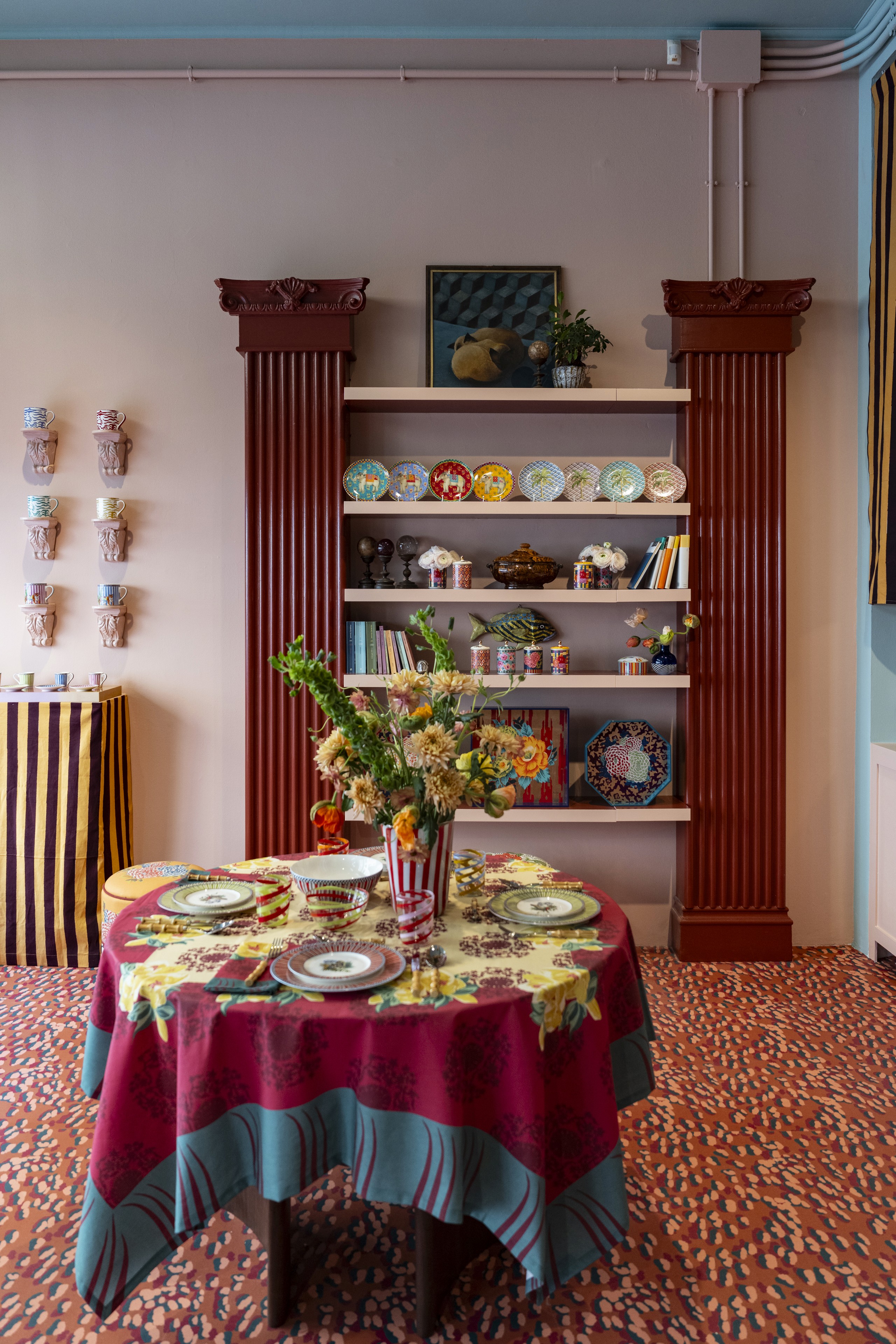
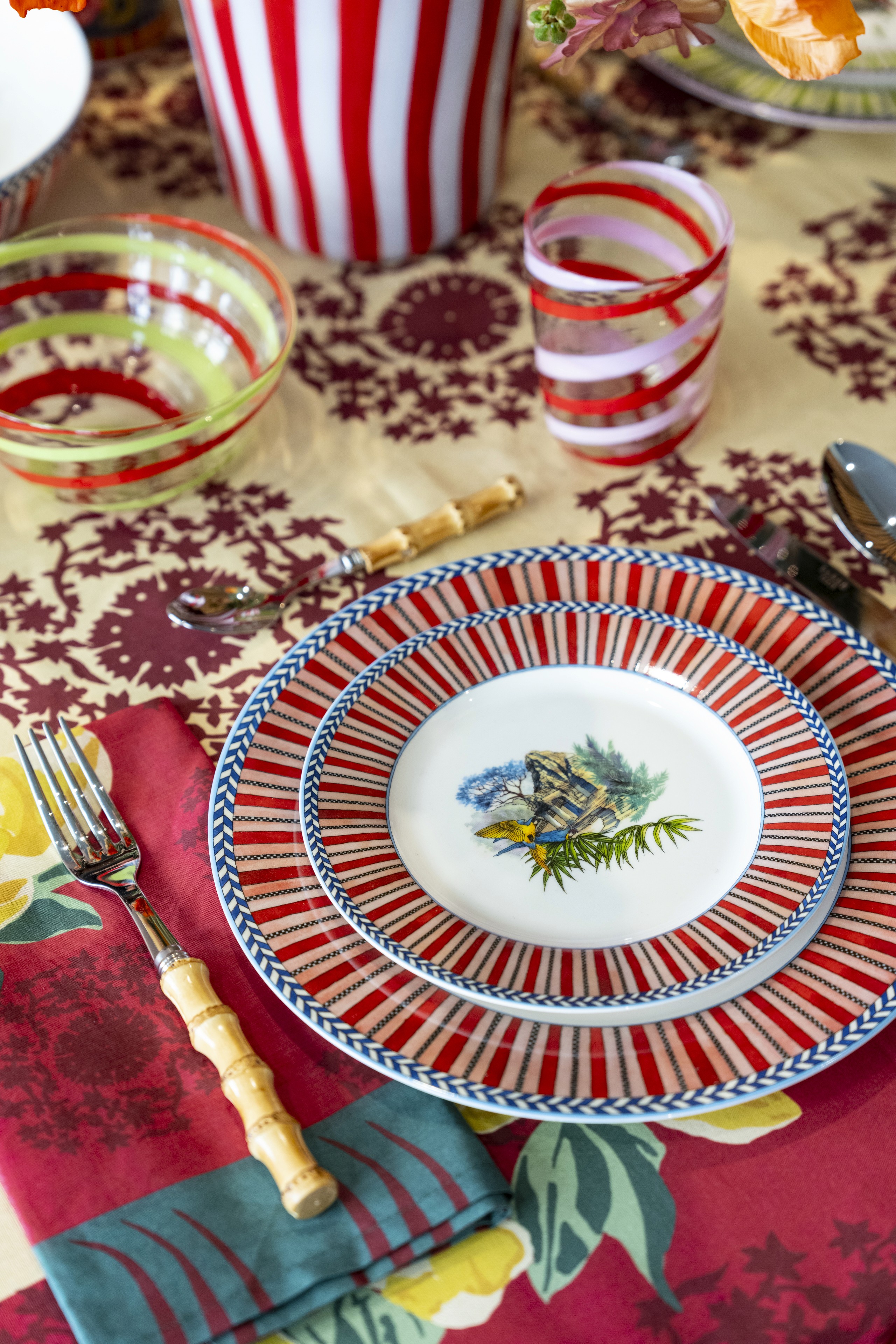
At Via Varese 8, a table was set with striped porcelain, spiral glassware, bamboo-handled cutlery, printed cloth, and flowers suspended above the setting. Each element held its own pattern, yet nothing appeared isolated. Red moved from the rim of a plate to a glass, then into a napkin and the broad stripes of a vessel. Blue returned as a narrow border, a painted landscape, and a cool pause among warmer tones.
The effect was not simply decorative. It was rhythmic. The room suggested that color can organize a space as clearly as architecture does—and that the smallest domestic object can change the emotional temperature of a day.
A Showroom Designed as a Lived Interior
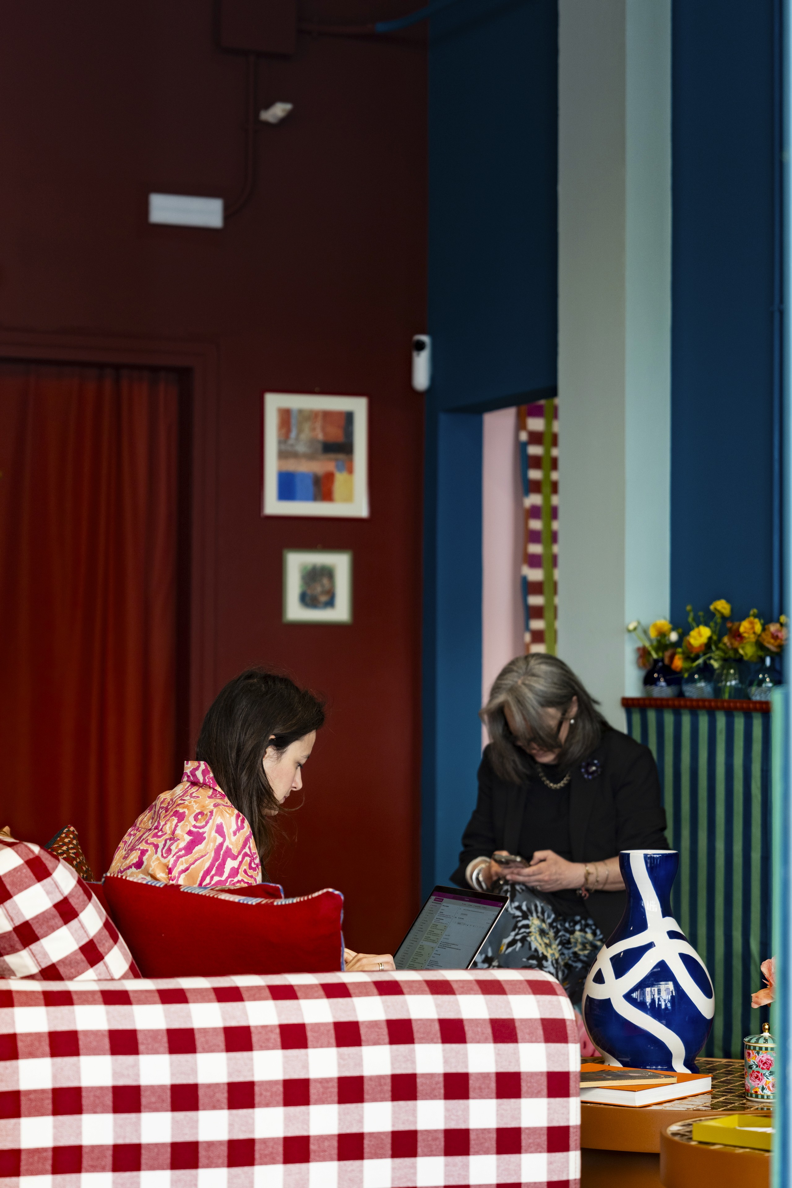
Lisa Corti opened the Brera showroom to visitors from April 21 through 26 during Milan Design Week, introducing a new home collection in the setting of an inhabited interior rather than a conventional product display.
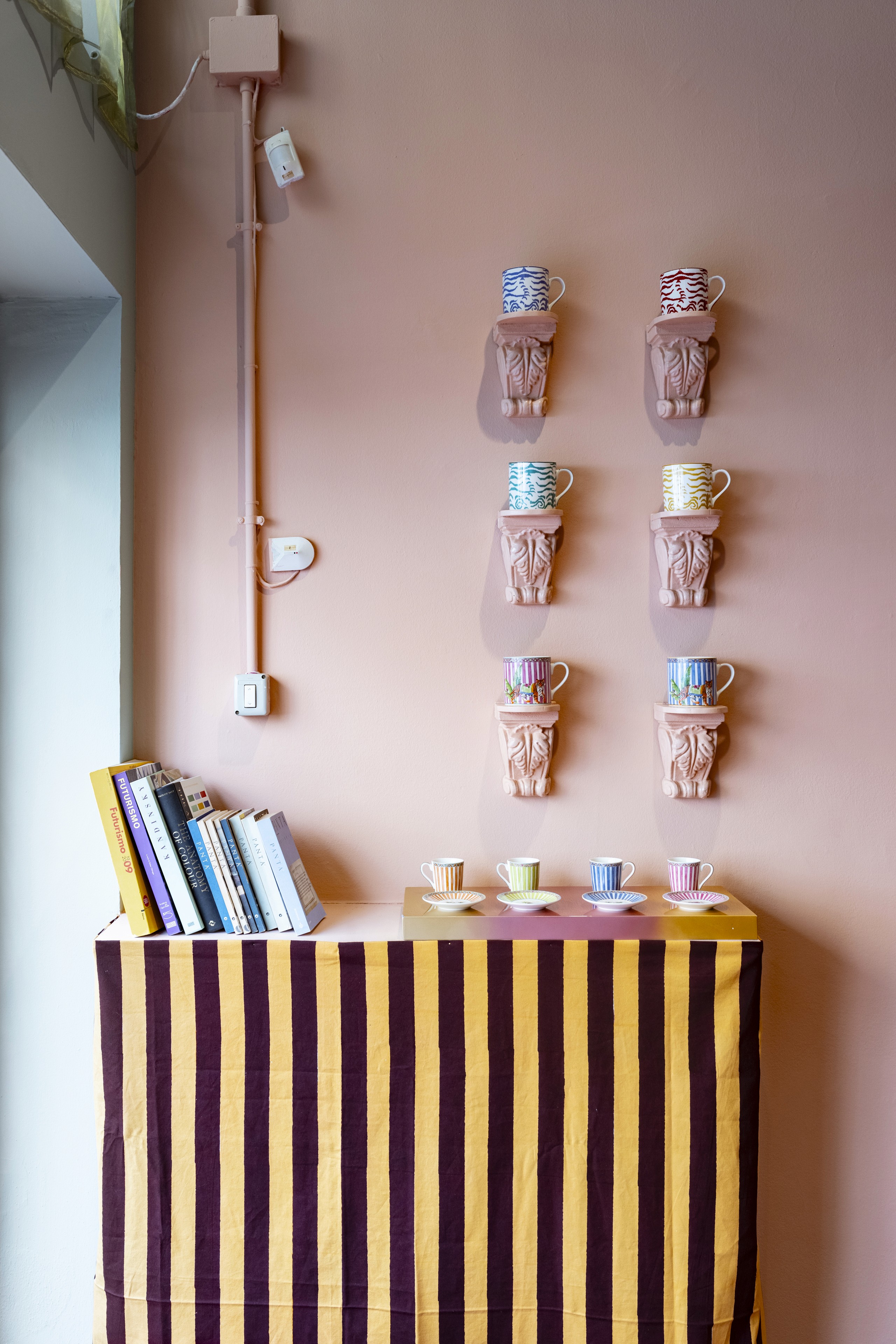
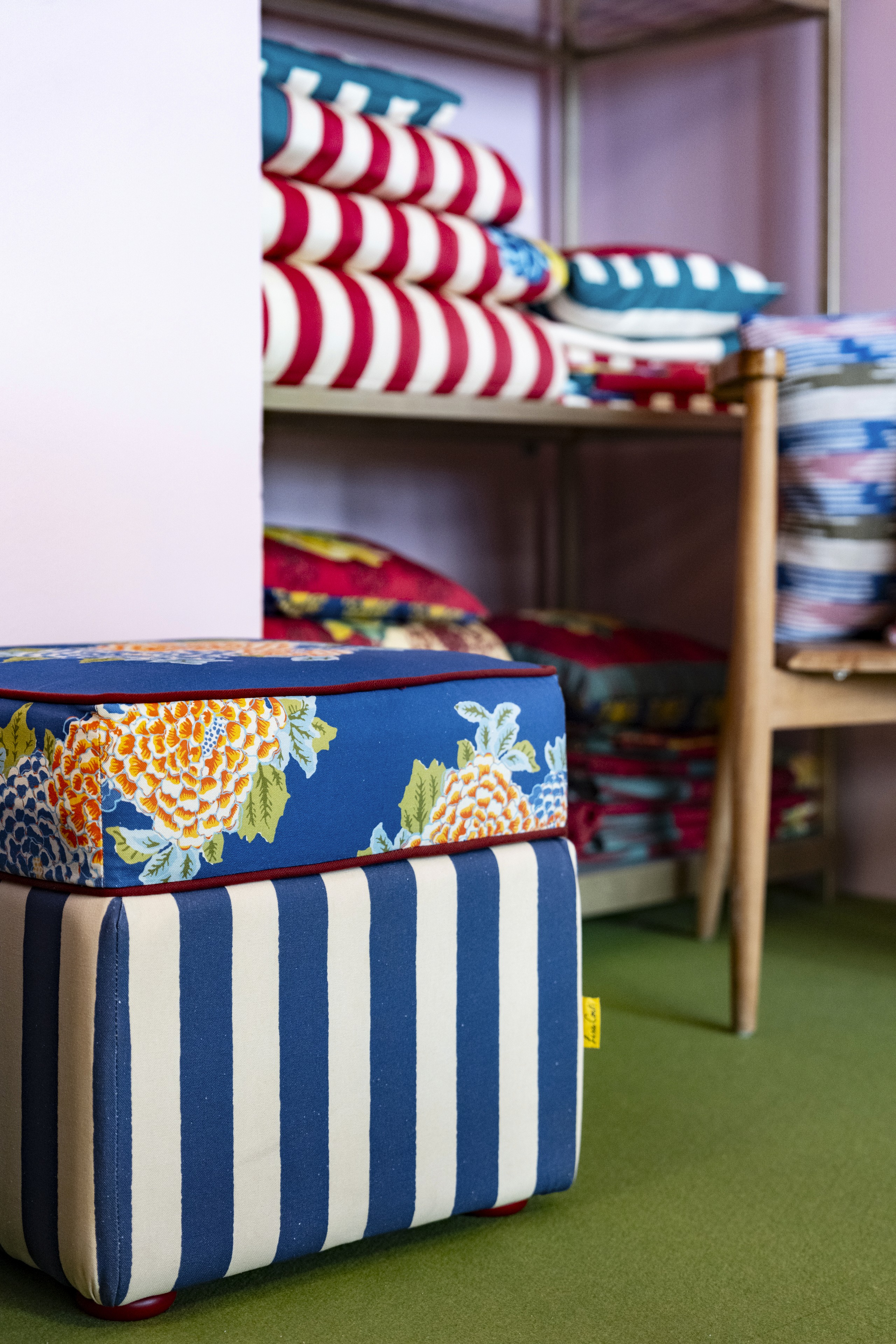
That distinction mattered. Objects were not lined up as isolated specimens. They appeared in relation to one another: porcelain against cotton, glass beside metal, flowers above pattern, and functional pieces arranged as if a meal might begin at any moment. The showroom allowed visitors to understand the collection through proximity and use.
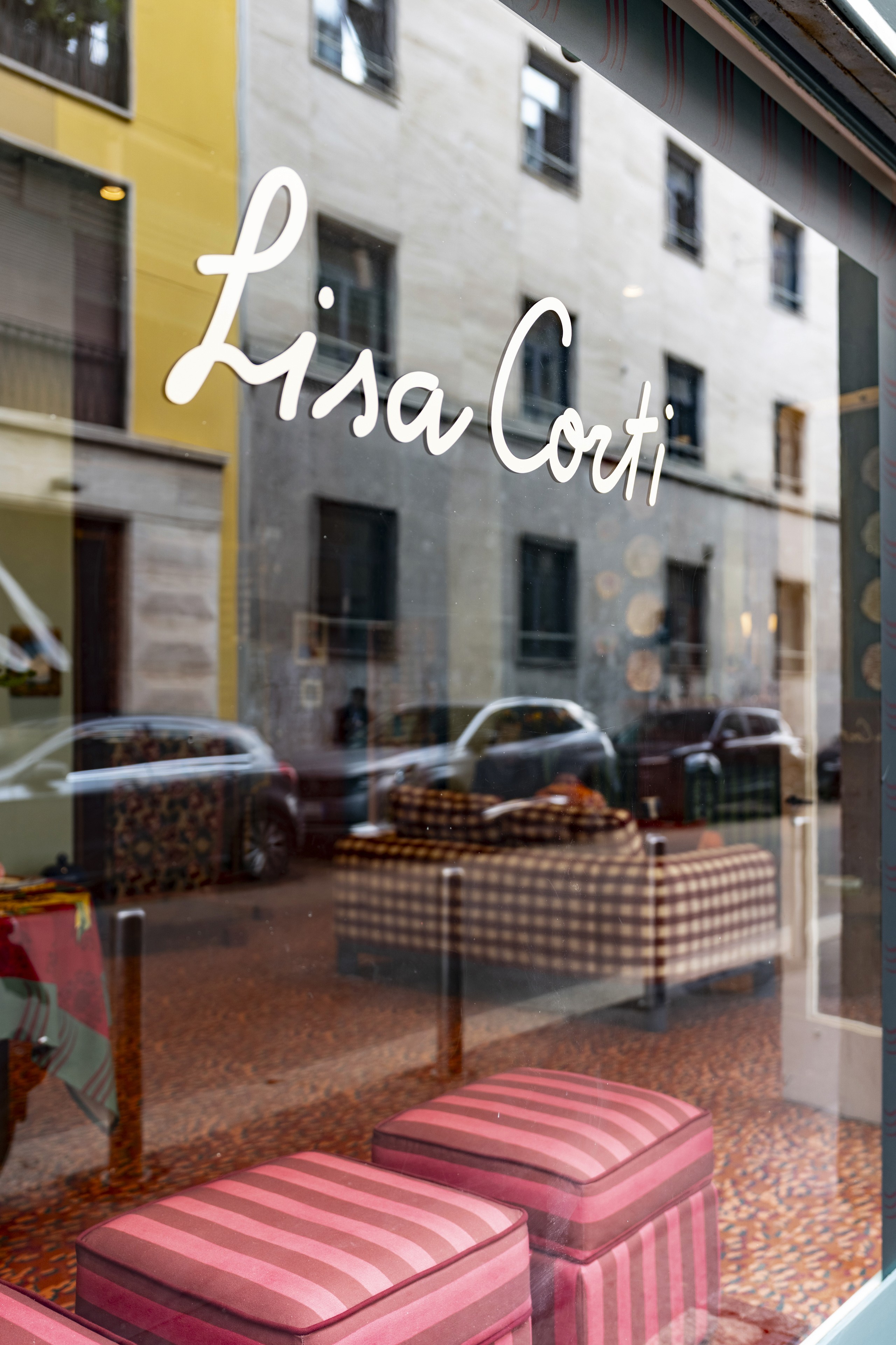
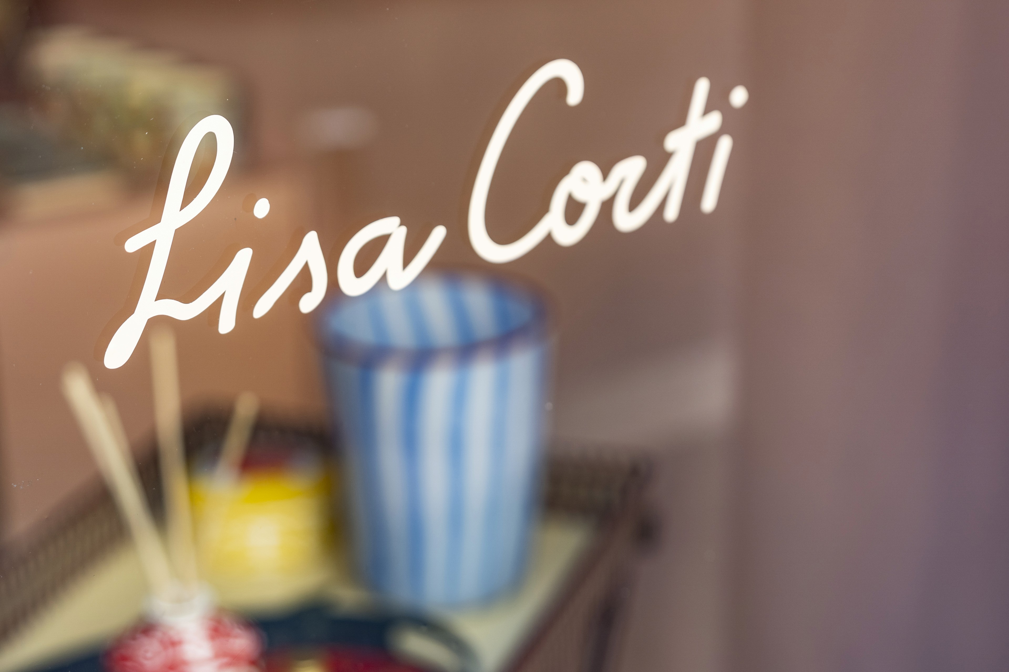
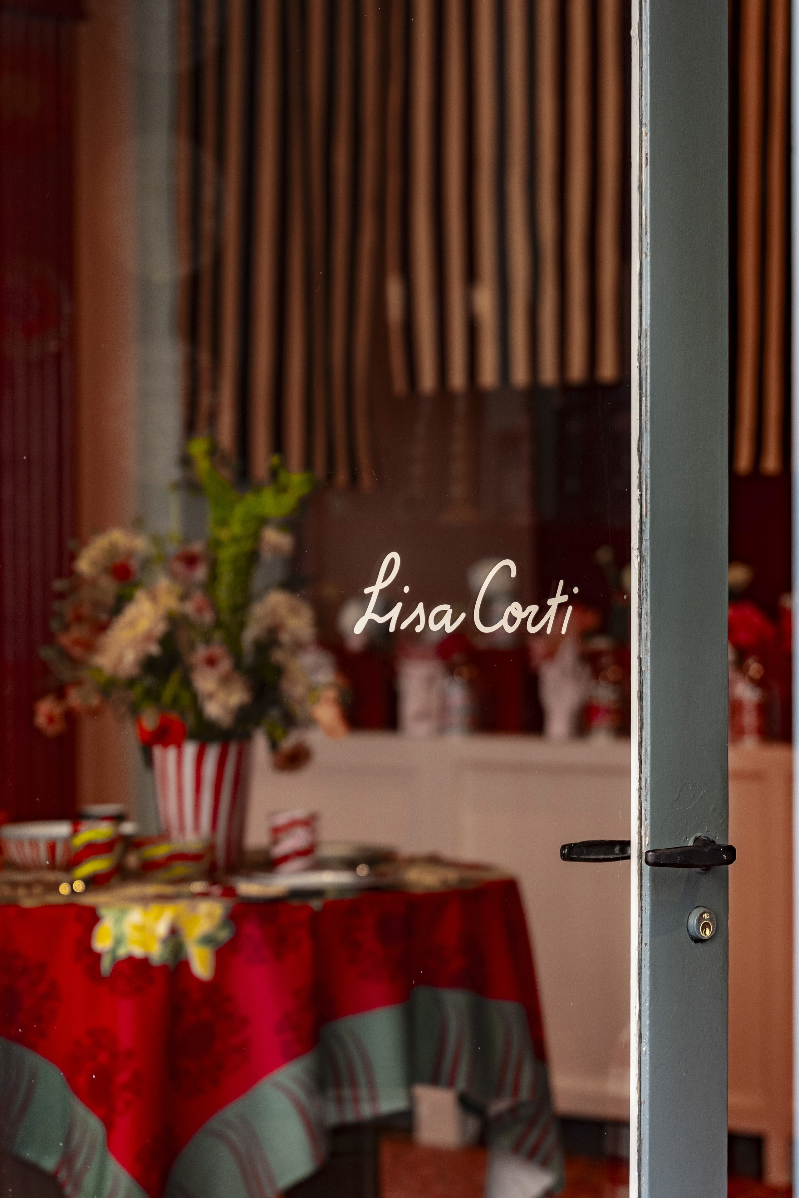
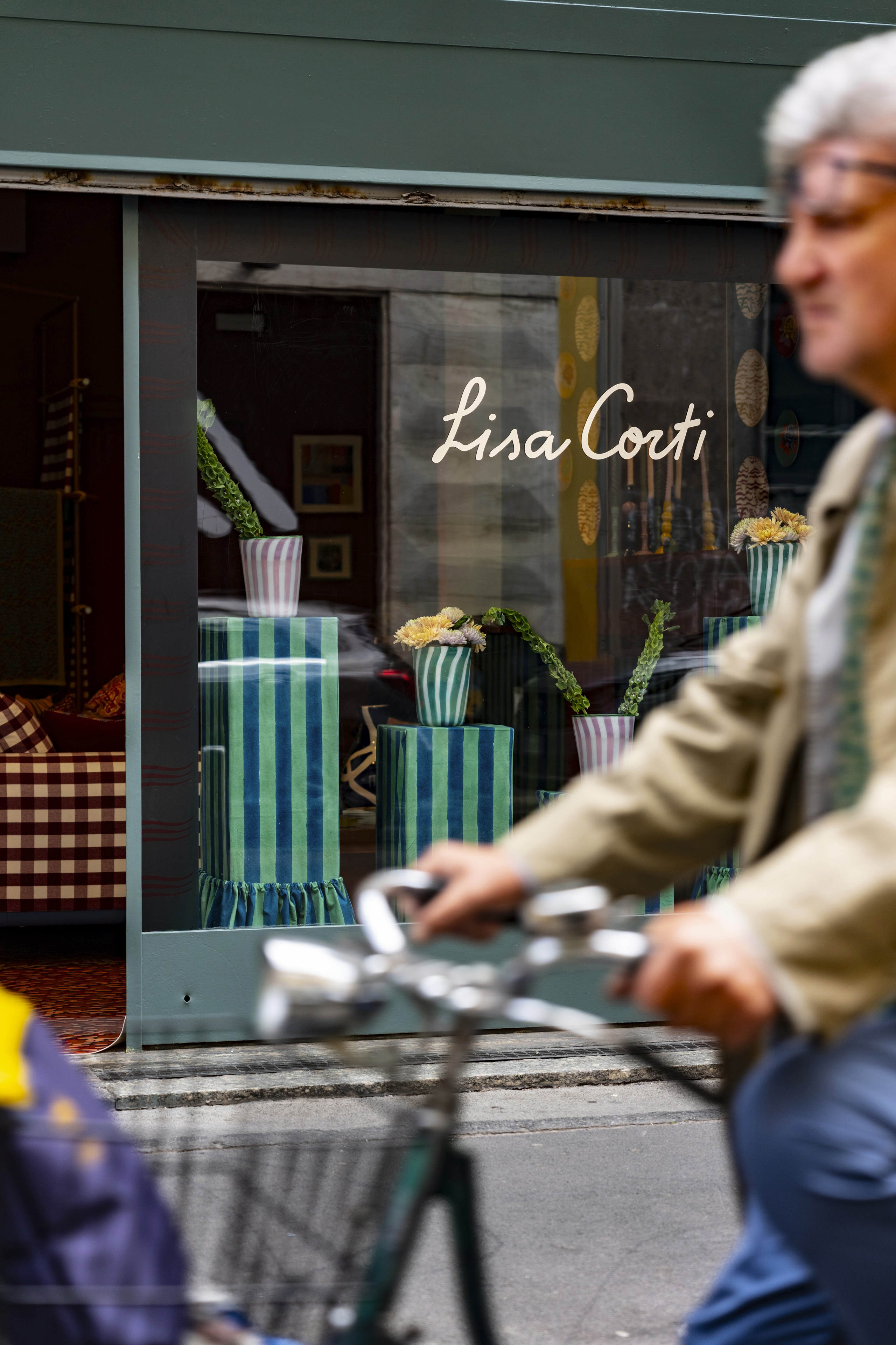
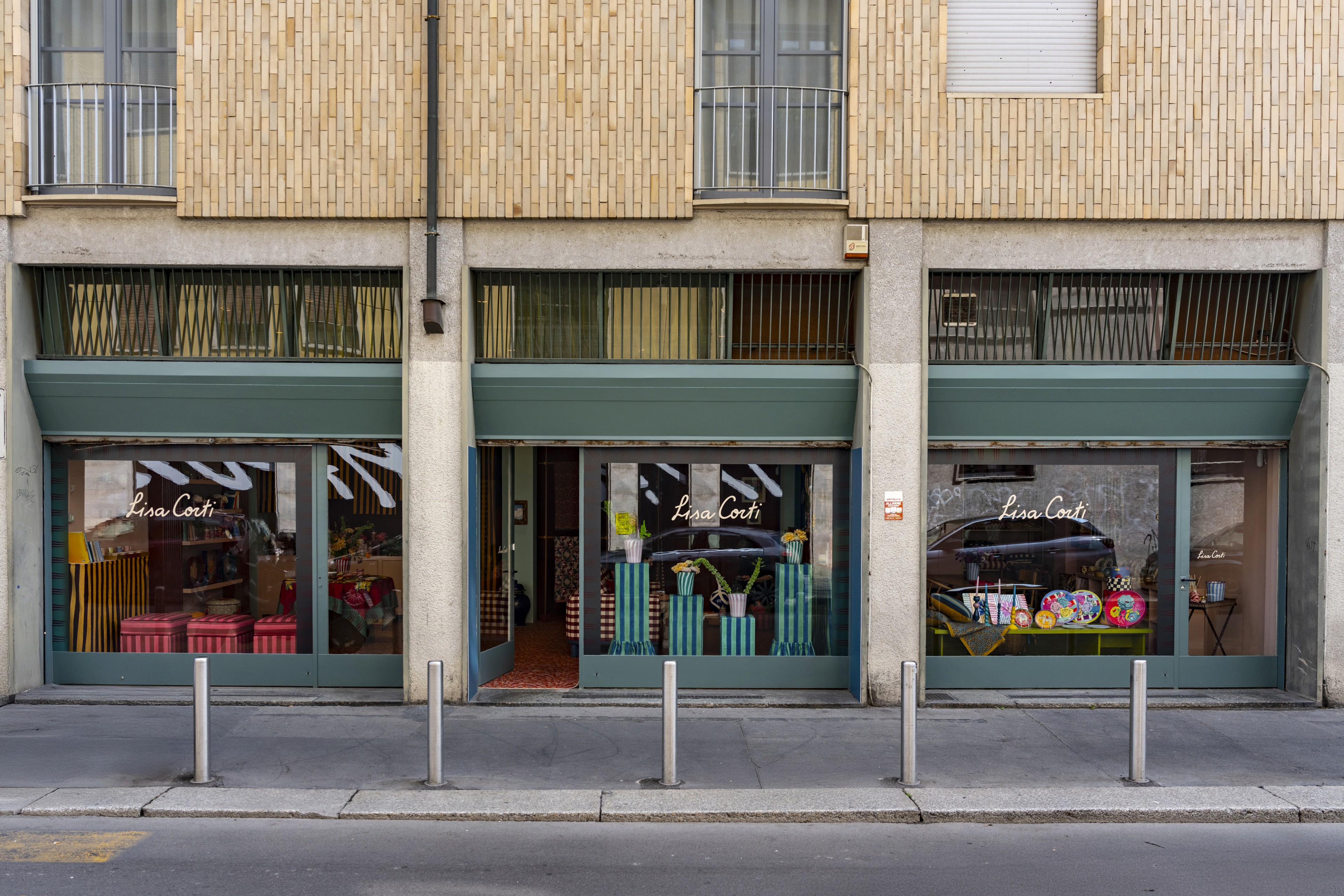
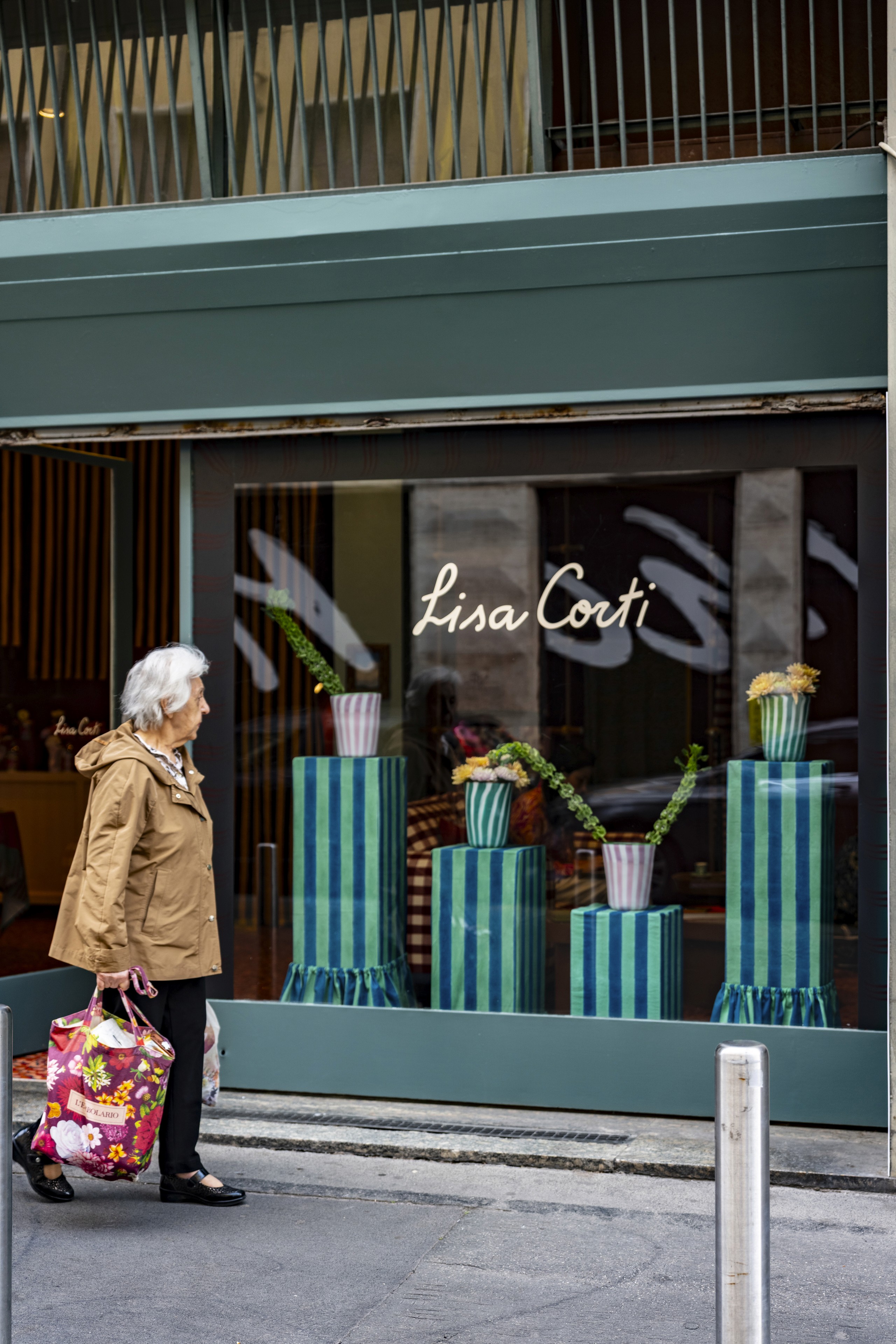
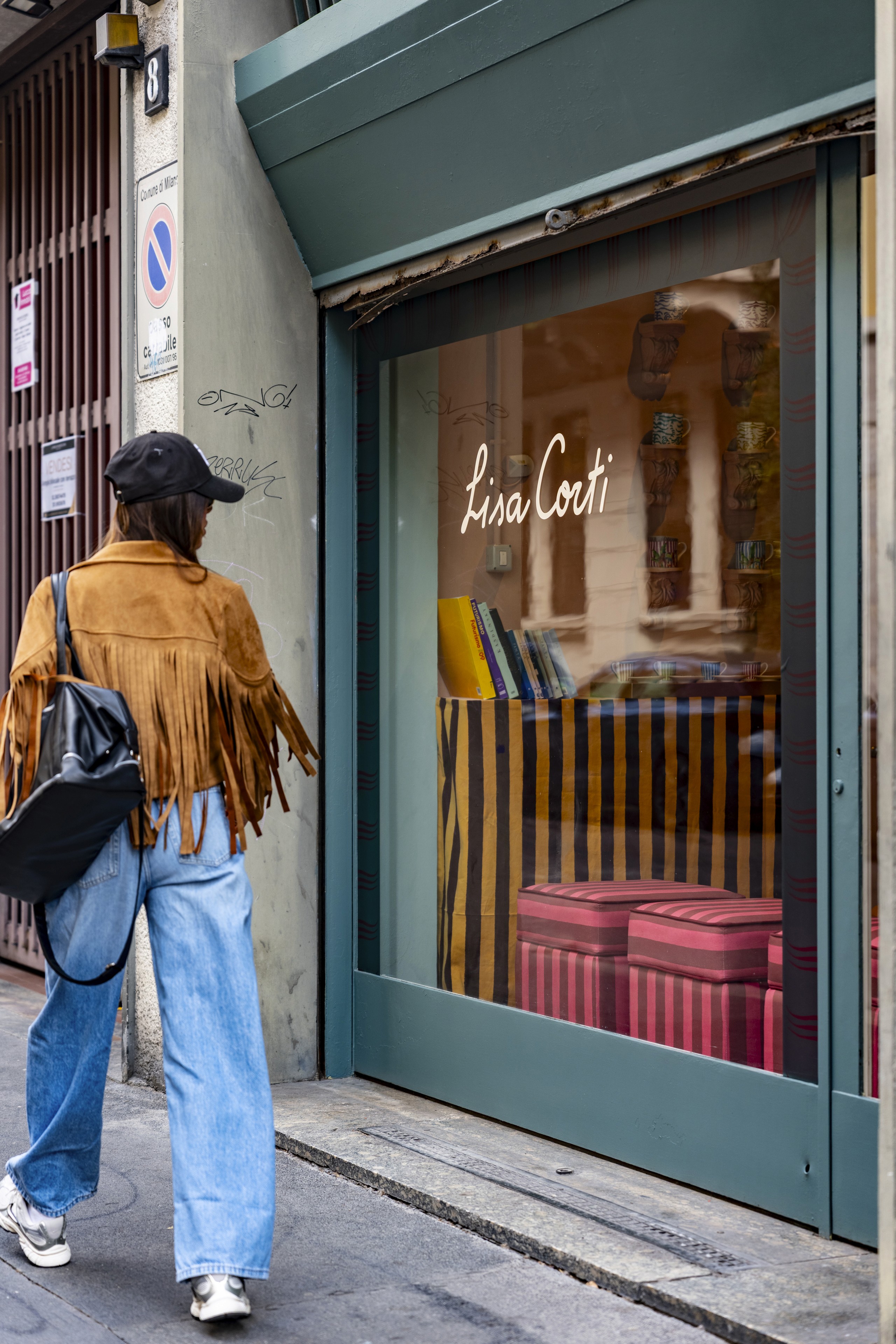
Seen from the street, the handwritten Lisa Corti name across the glass offered a quiet introduction. Behind it, saturated objects emerged through reflection and soft focus. Inside, the atmosphere became more immediate. The boutique was less a catalogue translated into space than a complete visual language—one built through layering, repetition, and an instinctive confidence in contrast.
The Table as a Place of Storytelling
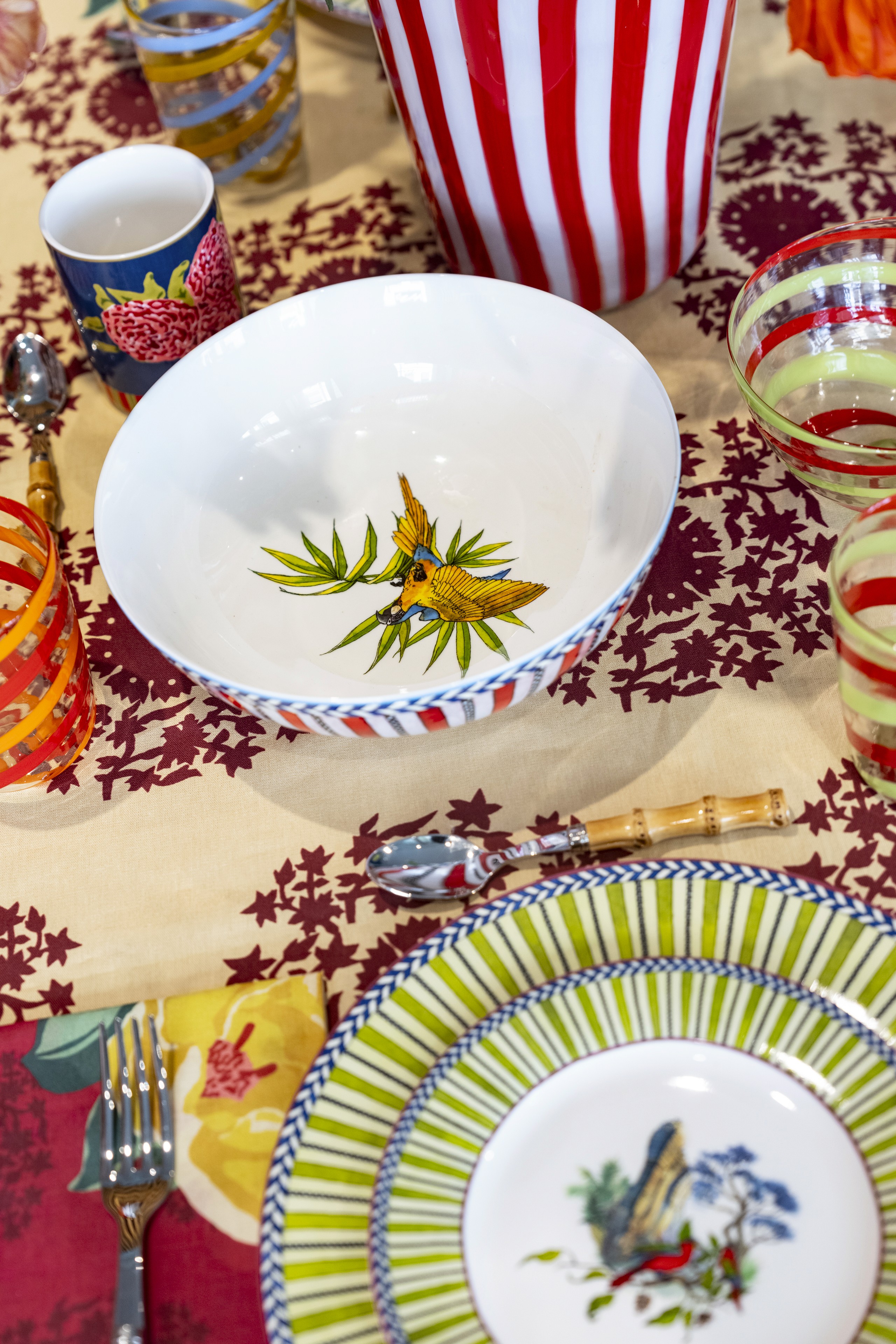
The photographed table centers on Lisa Corti’s Jungle Parrot Red porcelain. At the heart of the plate, a parrot appears within a miniature landscape of architecture and vegetation. The design originated in a journey to Cambodia, particularly the ruins of Angkor Wat, and was first developed in watercolor. Its narrative scene is framed by a sharply striped border, giving the plate the character of both an illustration and a functional object.
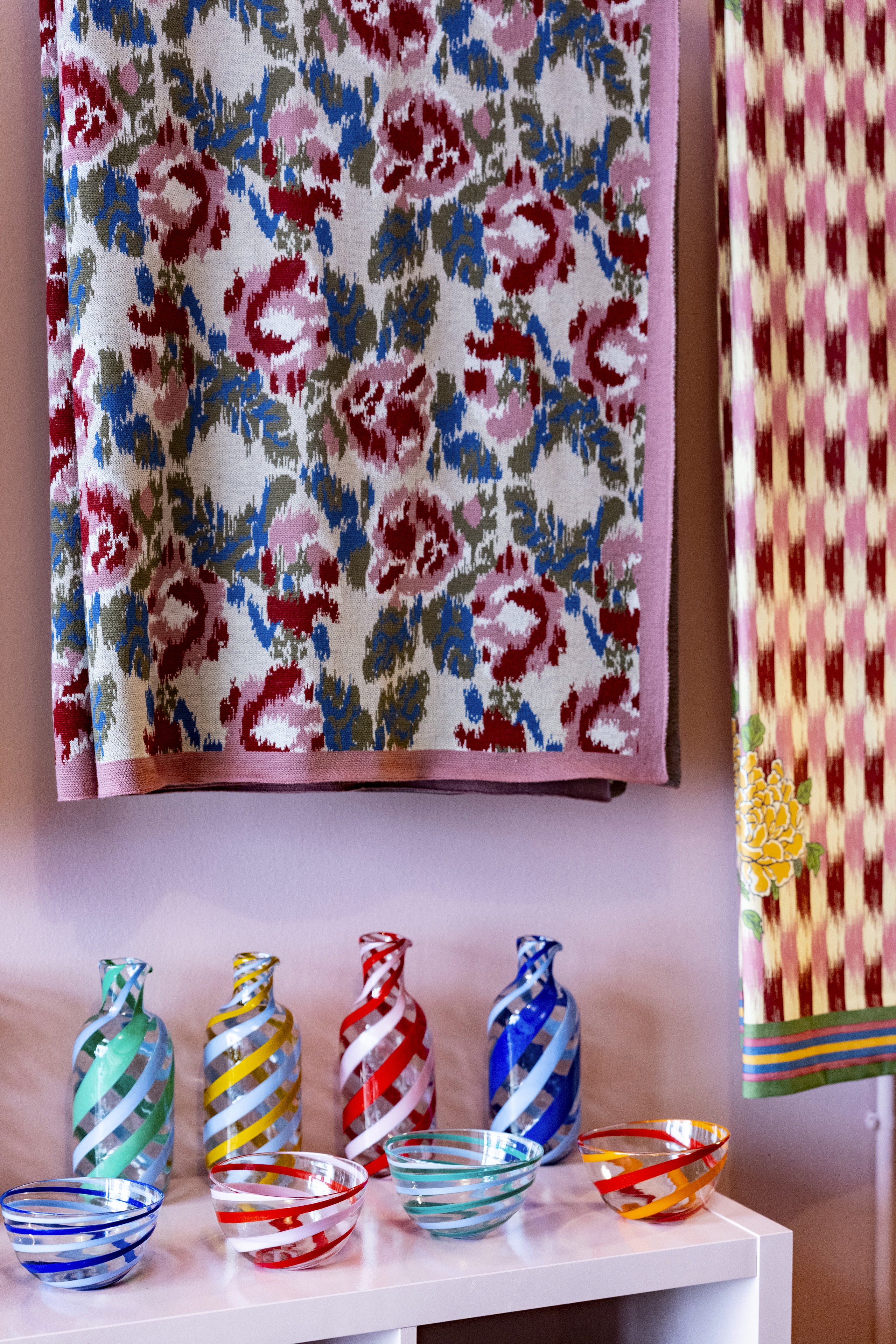
Around it, spiral glassware in red, pink, and green introduces transparency and movement. Bamboo-handled cutlery adds a tactile, natural note, while the textiles refuse the idea that a tablecloth and napkin must quietly recede. They act instead as full participants in the composition.
The setting demonstrates one of Lisa Corti’s most recognizable strengths: patterns do not need to match in order to belong together. Their connection can come through a repeated color, a shared line, or the tension between floral and geometric forms. The result is abundant, but not arbitrary. Every object contributes to the larger rhythm of the table.

Here, dining becomes more than service. It becomes a small act of scenography—a way of giving shape to hospitality before a guest has arrived or a dish has been served.
An Archive Reimagined for 2026
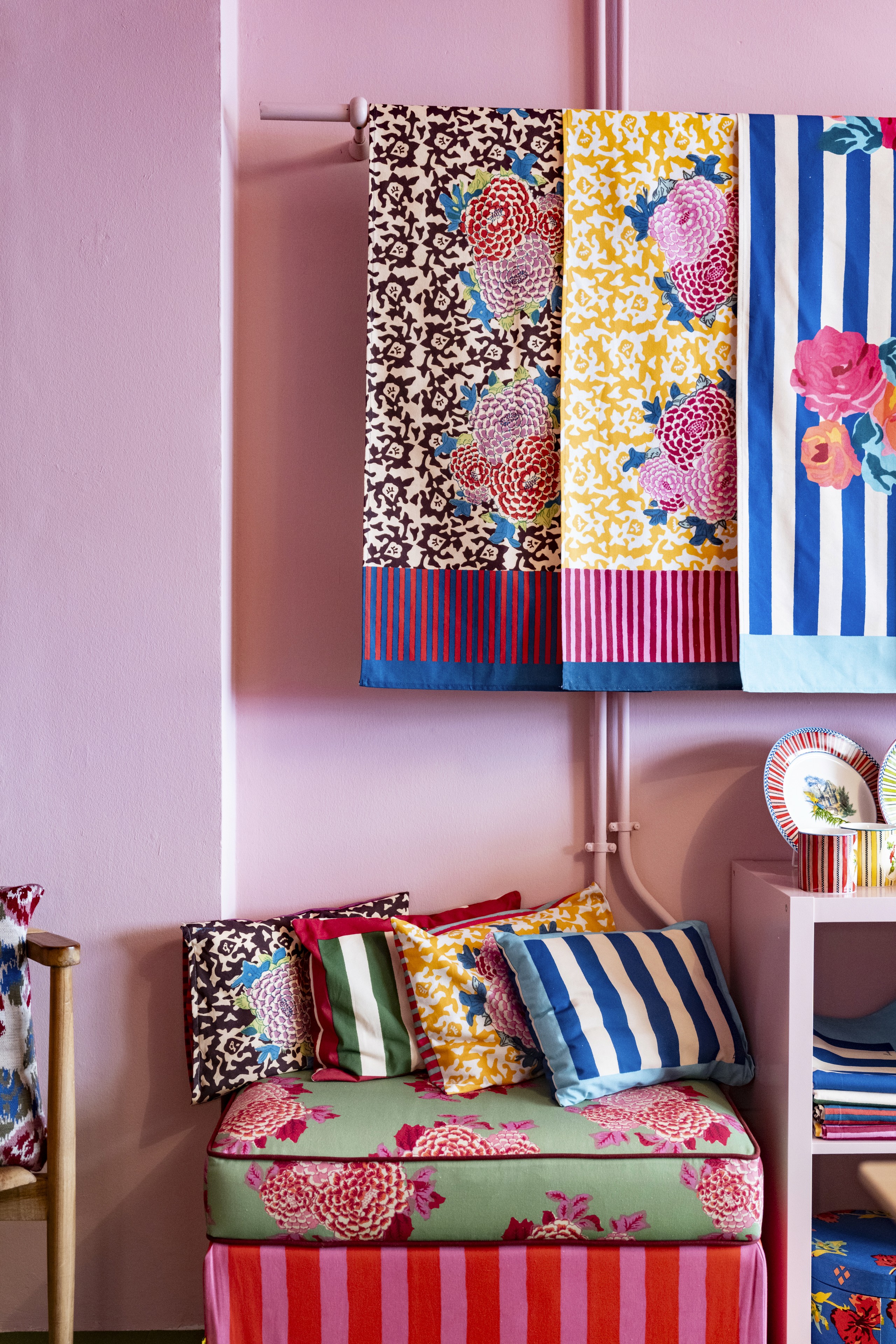
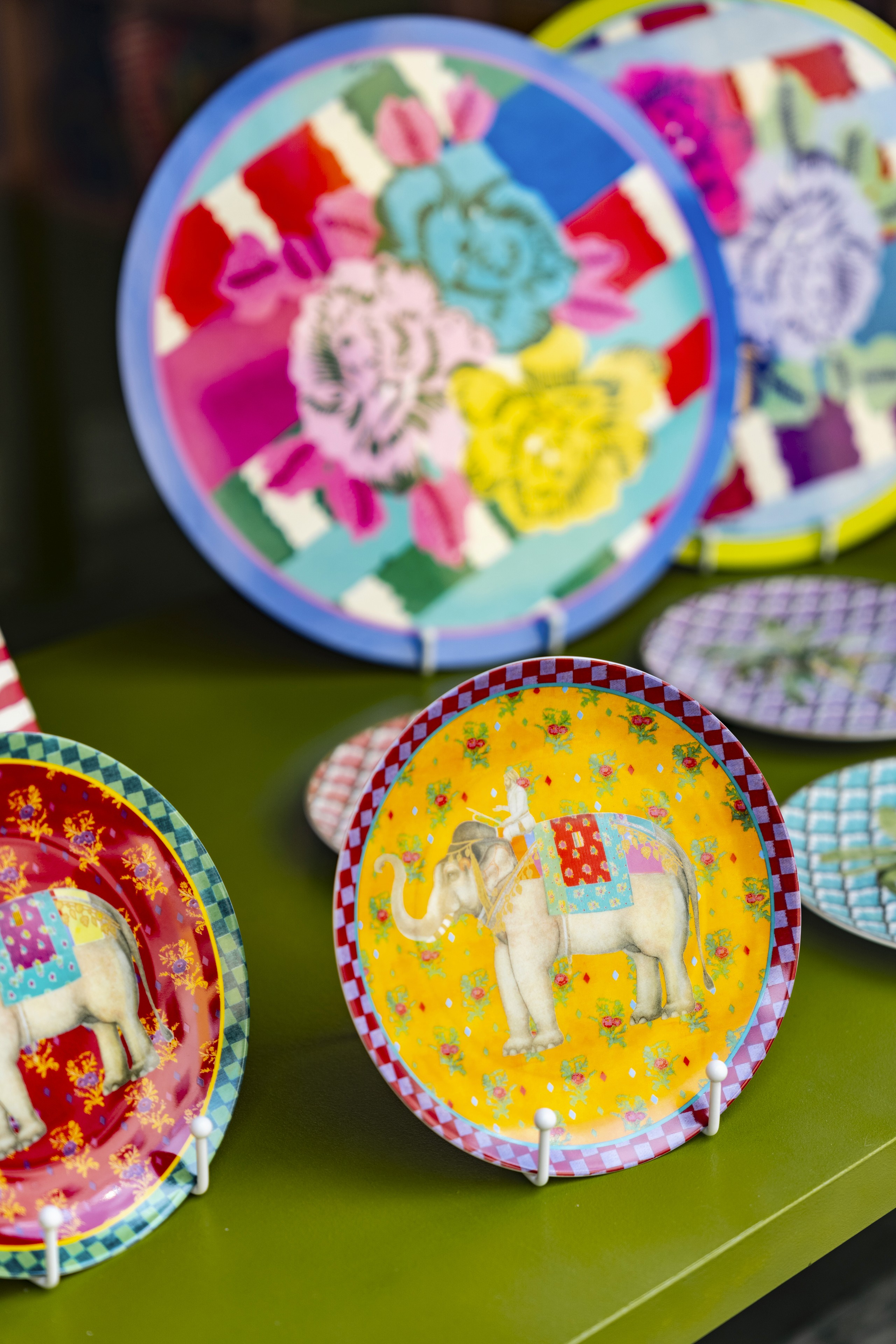
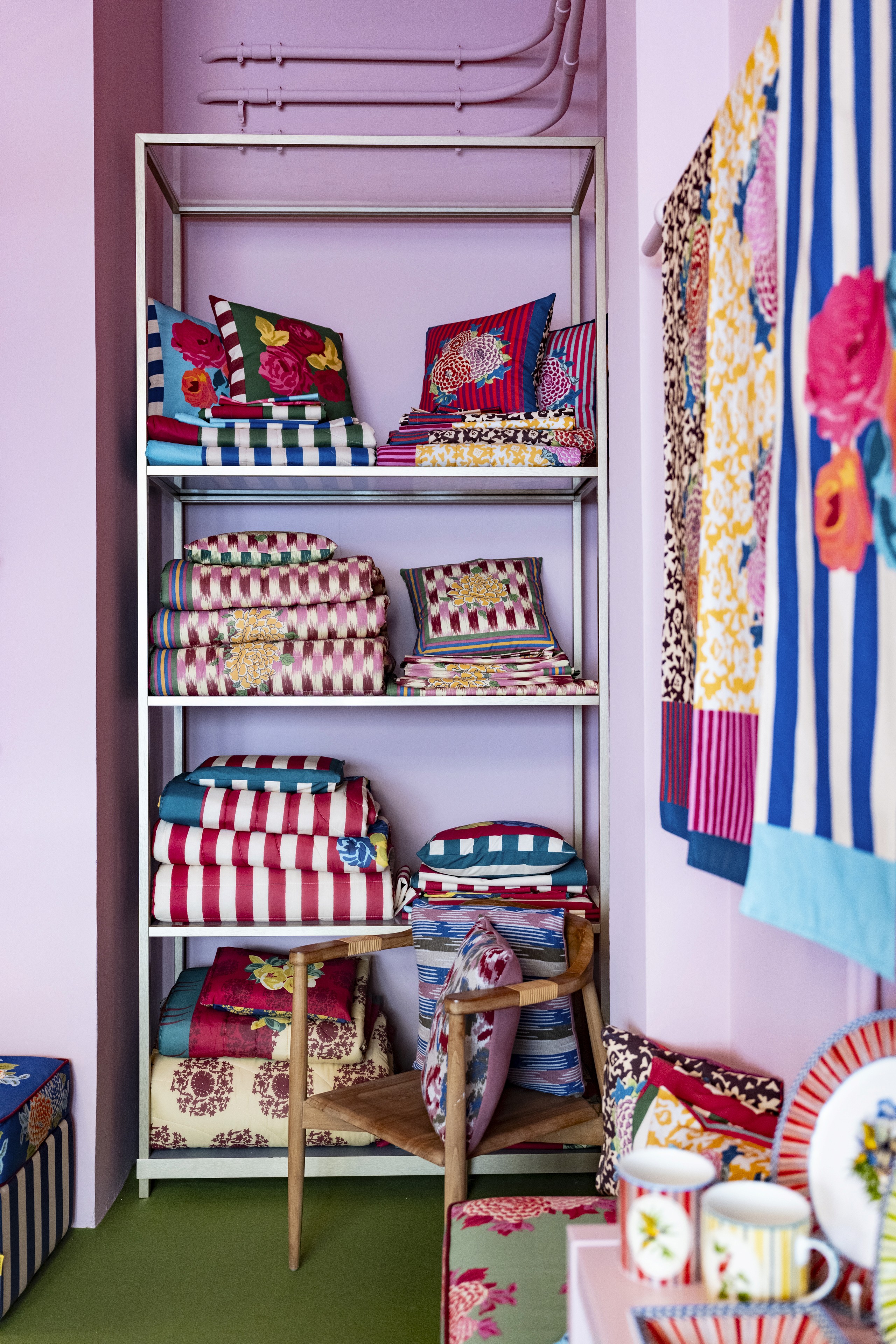
The 2026 home collection extended beyond the table to include candles, wool blankets and cushions, porcelain plates and coffee cups, lacquered trays and candleholders, table textiles, and fabric-covered boxes.

Its deeper story, however, was not expansion for its own sake. The collection returned to the Lisa Corti archive, revisiting established patterns through new color relationships and details. Crimson Small Ikat renewed the brand’s references to ikat dyeing and camellias. Planet brought together the medallion structures of Central Asian suzani textiles and the delicacy of Japanese magnolia. Nizam Stripes, one of the house’s identifying patterns, appeared in a new blue variation.
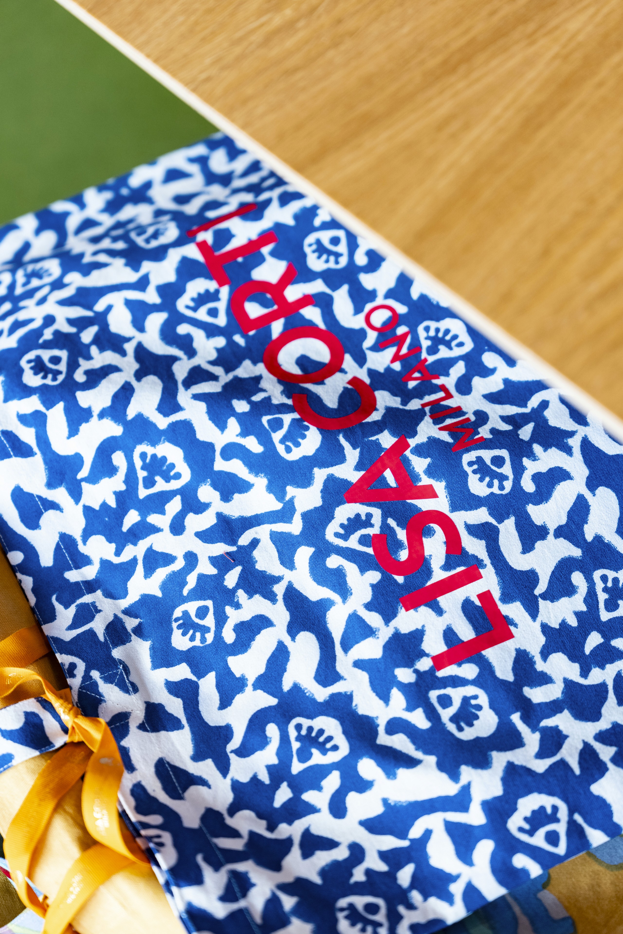
This approach gives the collection continuity without making it static. An archive is treated not as a museum of finished answers, but as a vocabulary that can be spoken differently over time. A familiar motif changes when its scale shifts, when a border is altered, or when a new color is placed beside it.
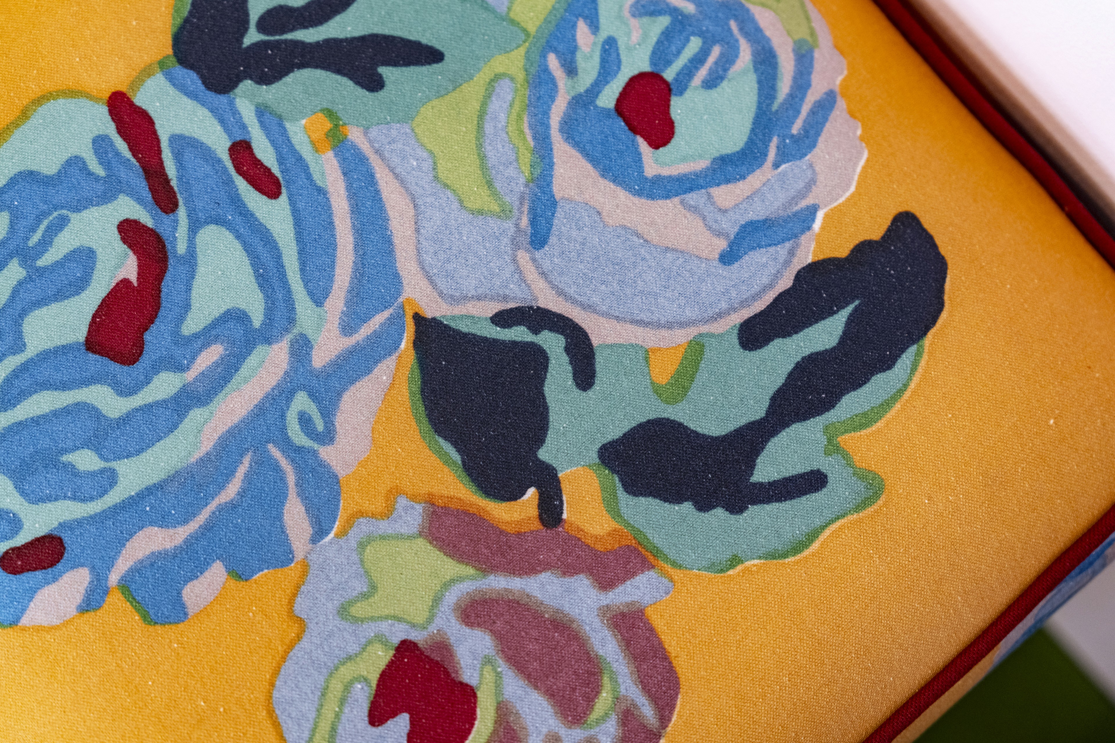
That capacity for reinvention is especially visible in the Brera showroom. The objects feel connected to a long history, yet the room does not appear nostalgic. It is contemporary because it remains open to combination.
A Life Shaped by Several Worlds
Lisa Corti founded her company in Milan in 1963. Her visual language was formed across several geographies: a childhood in Keren, Eritrea; a European cultural education; and later encounters with Indian textiles and techniques.
The brand’s history describes this synthesis in Lisa Corti’s own terms: an African sensibility, European culture, and an understanding of Indian techniques. It is not a superficial mixture of references, but the foundation of a design practice developed over decades.
Color is central to that practice. So is usefulness.
“Applying my imagination and passion for color to useful, everyday objects appealed to me,” Corti has said.
The sentence helps explain why her work moves so naturally across clothing, bedcovers, cushions, table linens, porcelain, and glassware. The home is not treated as a lesser stage for creativity. It is where creativity becomes part of ordinary time.
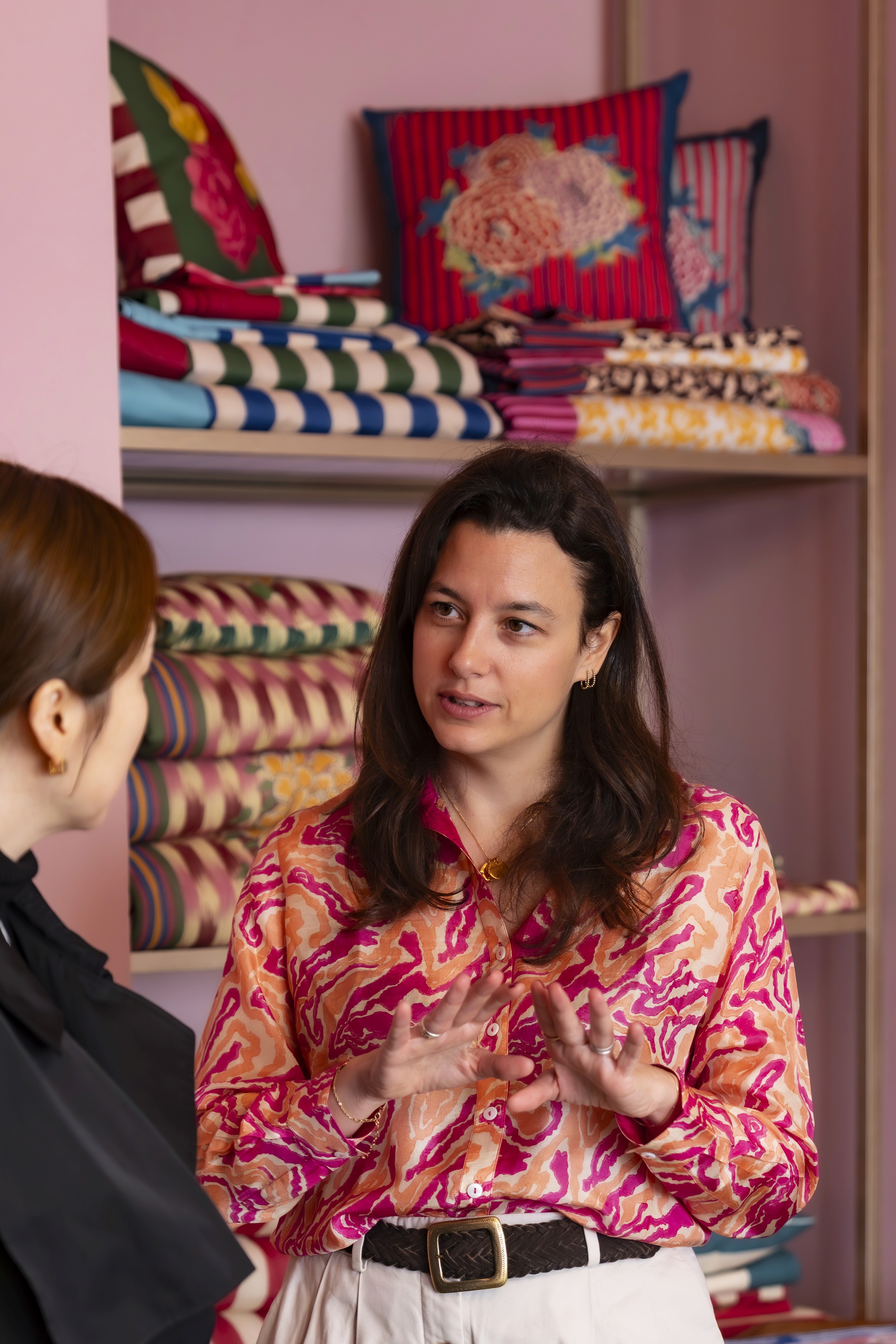
Today, the company continues under the leadership of her daughter, Ida Corti, with the archive remaining central to its evolving identity.
Craft Without Formality
Many Lisa Corti fabrics are made through block printing, a process in which carved wooden sections are dipped in pigment and pressed onto cloth one color at a time. The method requires patience and technical control, but it also leaves room for slight variations. Those variations are not hidden. They register the hand, the pressure of the block, and the sequence through which a pattern was built.
This balance between discipline and lightness is essential to the brand. The compositions may feel spontaneous, but spontaneity is supported by knowledge: how one pigment behaves against another, how a border contains a floral field, and how a fabric changes once it is folded, draped, worn, or placed on a table.
Craft, in this context, is not presented as solemn. It is allowed to be playful. The work respects technique without turning technique into a burden for the viewer.

The Intelligence of Joy
Milan Design Week often gives design a monumental scale. Installations occupy palaces, courtyards, warehouses, and entire streets. Against that backdrop, Lisa Corti’s Brera presentation made a quieter proposition: daily life is also a legitimate site of design ambition.
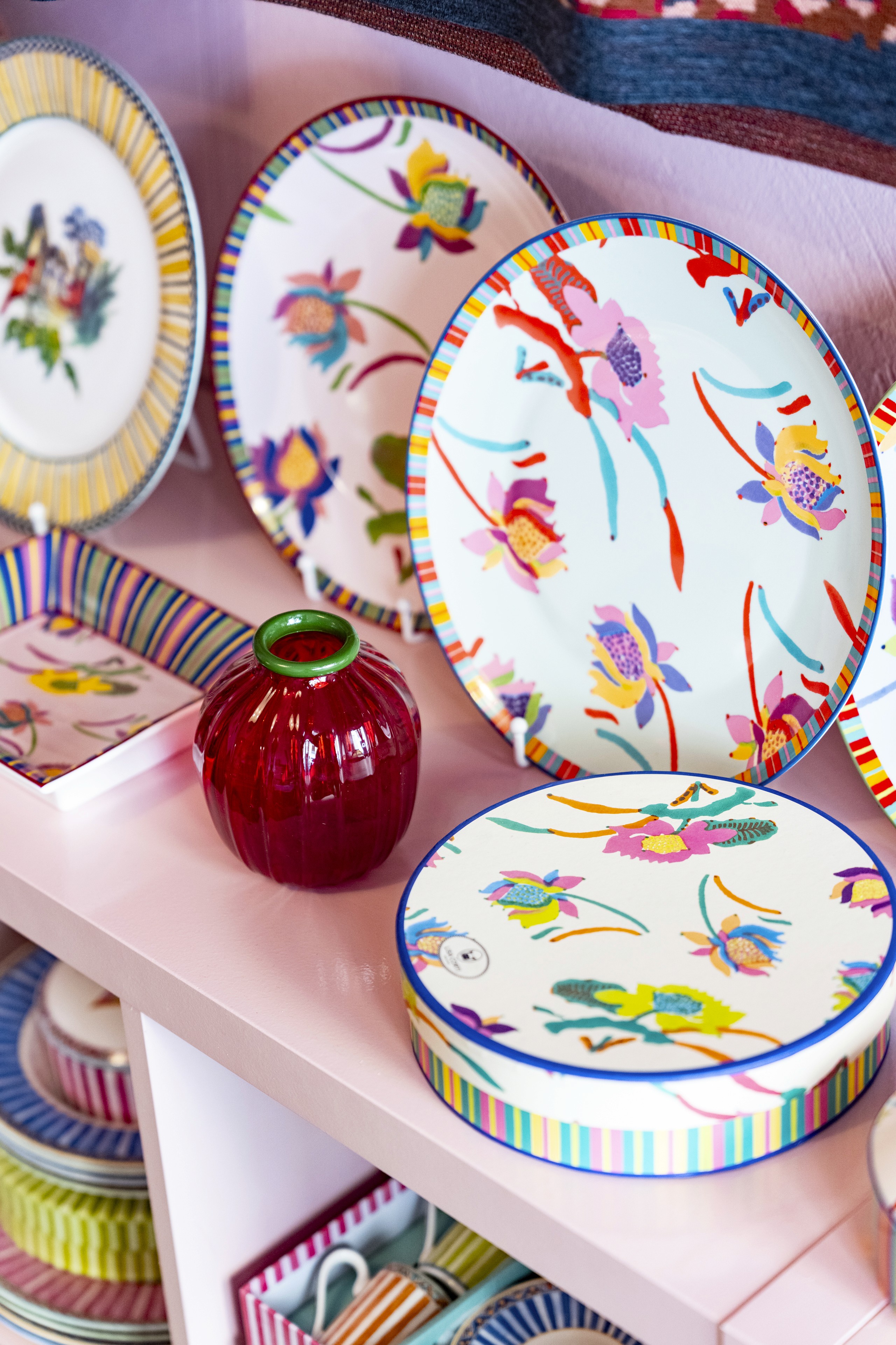
A plate can carry the memory of a journey. A textile can connect several visual traditions without reducing them to a single origin. A drinking glass can bring movement to a table before it is touched. None of these objects needs to abandon usefulness in order to hold cultural meaning.
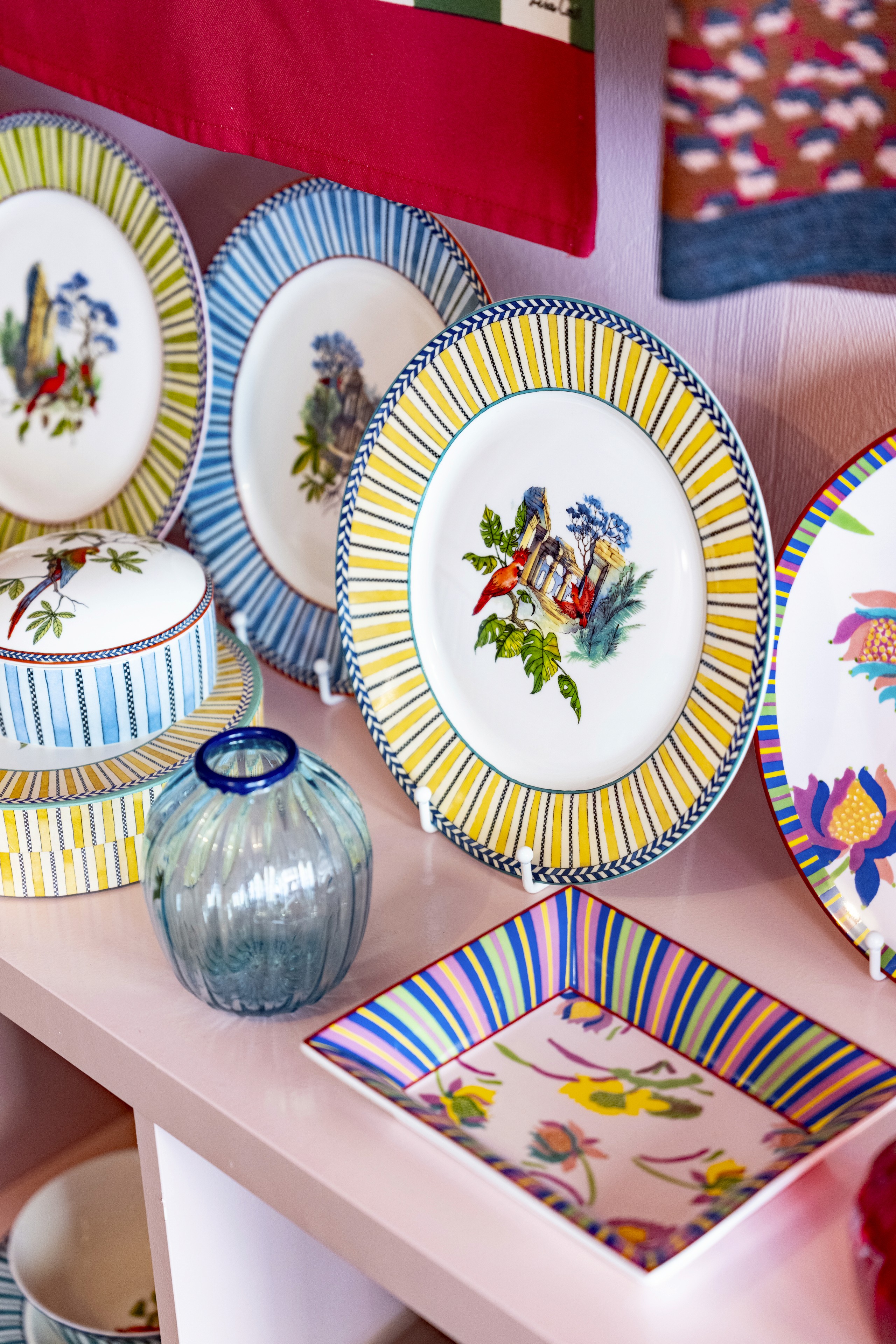
The showroom’s most persuasive quality was its refusal to separate beauty from living. The table was not perfected into stillness; it seemed ready to be used. The patterns did not wait for permission to coexist. They created their own order through energy, repetition, and trust in color.
At Via Varese 8, Lisa Corti offered more than a new collection. The showroom became an argument for joy as a form of intelligence—an ability to recognize that the objects nearest to us can carry history, craft, and imagination without losing their ease.
In a city temporarily transformed by design, this was a reminder worth keeping: the home becomes meaningful not when every element is controlled, but when objects begin to speak to one another—and when there is still room at the table for surprise.

© 2026 Brunch Magazine. All rights reserved. Unauthorized reproduction, distribution, publication, or use of any text or photographs is strictly prohibited and may result in legal action.
